The Spice Souq
The Spice Souq is a modern spice brand inspired by the rich heritage of traditional Middle Eastern souqs. We were commissioned to create a complete brand identity and packaging system that could capture the authenticity of artisanal spice trading while positioning the brand as a contemporary, premium destination for culinary discovery.
The Challenge
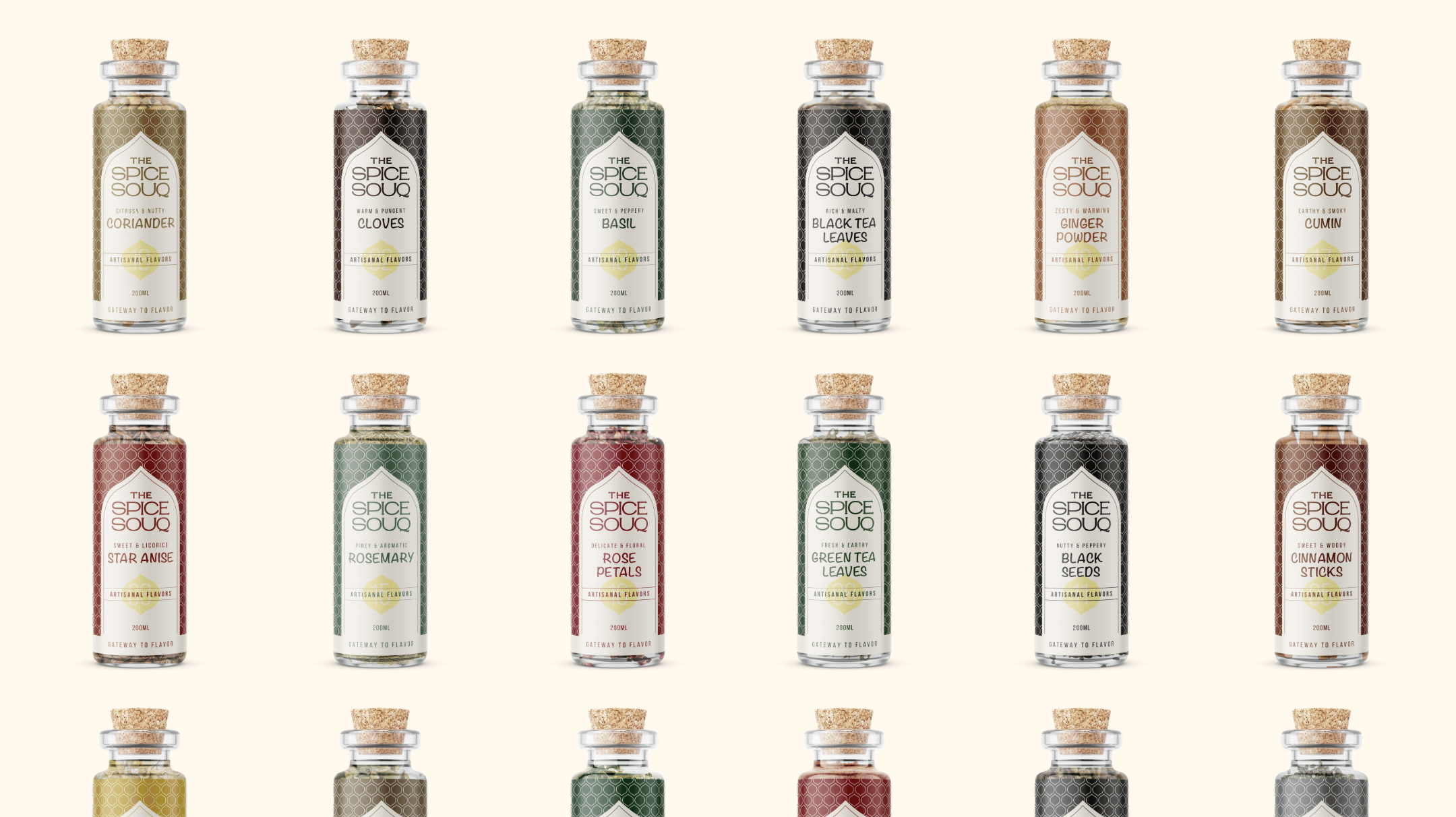
The challenge was to build a distinctive identity in a crowded food and spice market where many brands rely on generic visual cues. The brand needed to communicate authenticity, craftsmanship, and cultural heritage without feeling dated or overly traditional. It also required a packaging system that could scale across multiple products while maintaining strong shelf presence and a cohesive brand experience.
The Approach
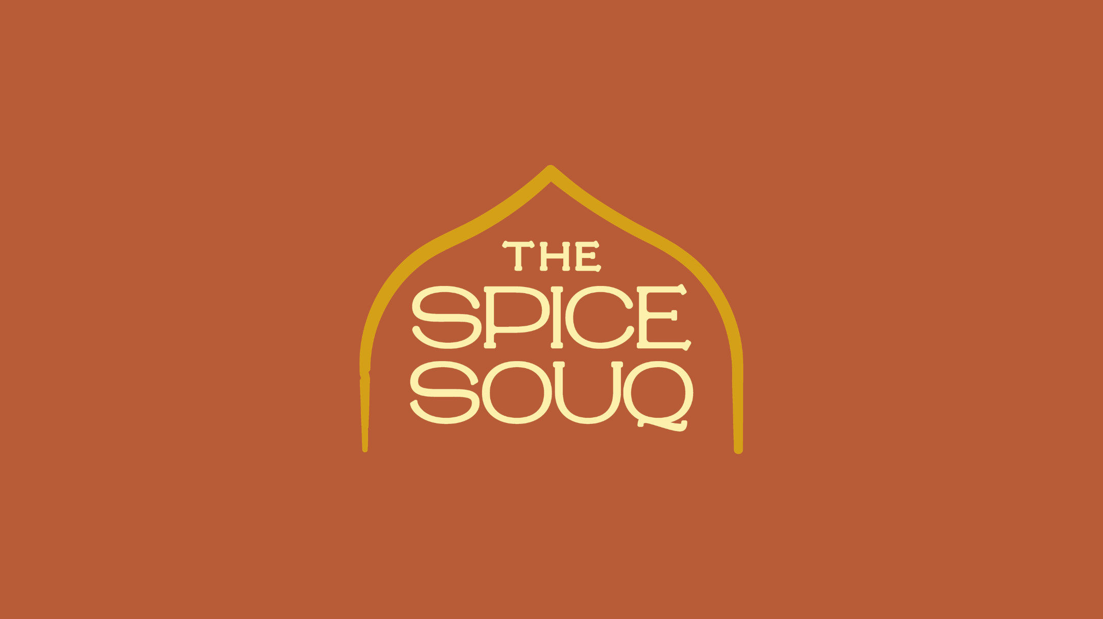
Our solution was rooted in the architectural language of ancient souqs. We drew inspiration from their iconic arched entrances, transforming this familiar gateway into the central visual device of the identity. The arch informed both the logo and packaging structure, creating a recognizable system that evokes exploration, trade, and cultural exchange. Earthy olive greens and warm beige tones were selected to reflect natural spices and handcrafted quality, while a refined serif wordmark balanced heritage with modern sophistication. Every element was designed to work seamlessly across labels, packaging, and future brand applications.
The Outcome
The result is a timeless and flexible identity system that gives The Spice Souq a strong, memorable presence across every touchpoint. Guided by the positioning statement, “Gateway to Flavor,” the brand now communicates a clear sense of place, authenticity, and discovery. The identity successfully bridges tradition and modernity, creating a visual experience that invites customers to explore, taste, and connect with the world of spices through a cohesive and premium brand expression.
Wow! This is soooo Impressive! Thank you very much